Color Scheme Setup
Color scheme (light/dark) support is configured in the ACSS dashboard under Color Scheme (Light/Dark). When you enable it, ACSS converts your palette to use light-dark() and sets color-scheme so the browser and your variables stay in sync.
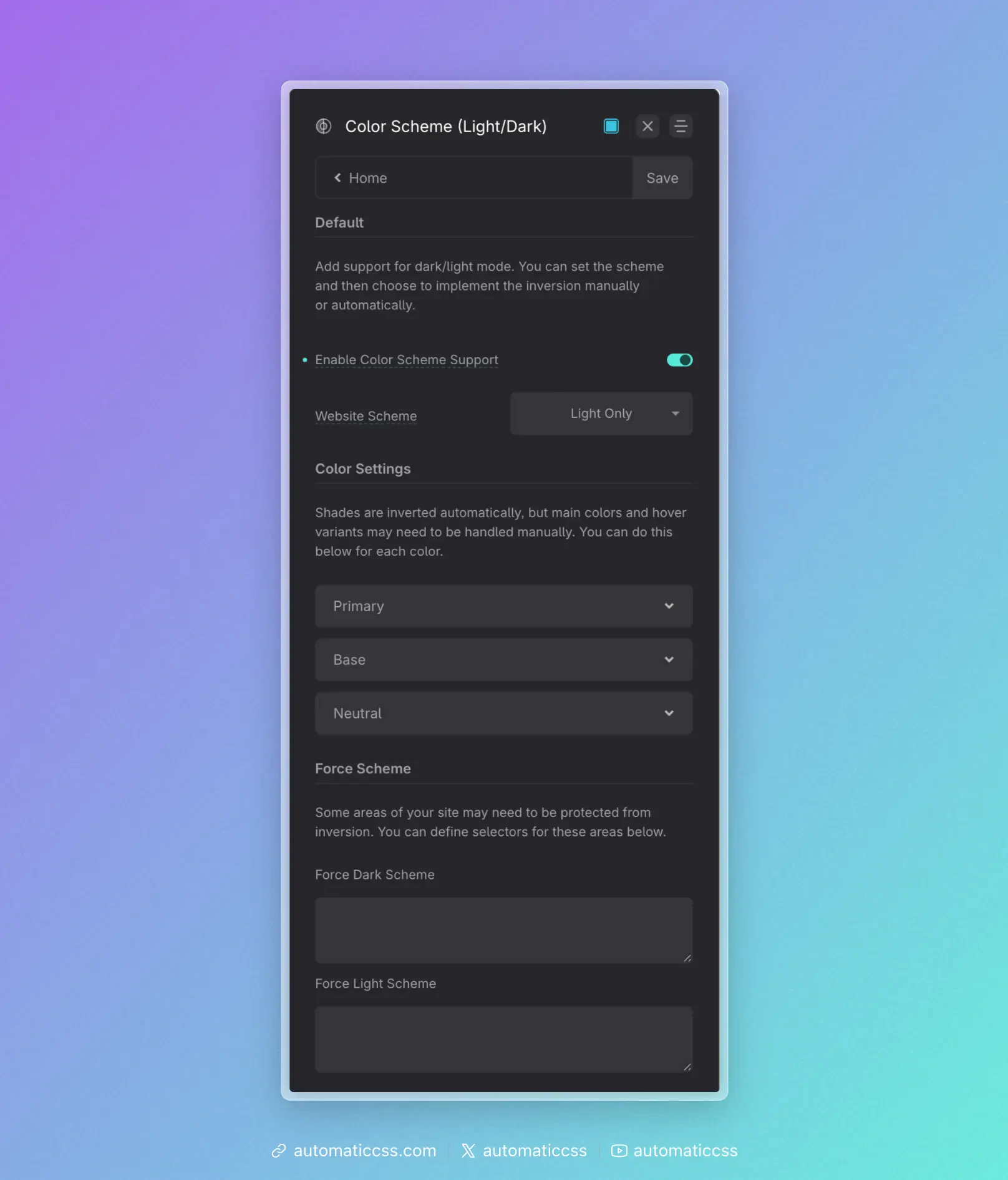
Enable Color Scheme Support
Turn Enable Color Scheme Support on to:
- Convert all colors and shades – Every palette variable is output as
light-dark(light-value, dark-value)instead of a single value. Sovar(--primary),var(--base-dark), etc. automatically resolve to the right color for the current scheme. - Auto shade inversion – For each color, the shades (ultra-light, light, semi-light, semi-dark, dark, ultra-dark) are paired for light/dark: in dark mode, “ultra-light” shows the ultra-dark value, “ultra-dark” shows the ultra-light value, and so on. You don’t define dark-mode shades manually; they’re derived by inverting the light-mode scale.
- Enable color scheme utilities – The
.scheme--lightand.scheme--darkclasses (and any force-selectors you set) become meaningful, so you can force a scheme on specific areas.
With support off, palette variables are single values (no light-dark) and the site effectively has one scheme.
Website Scheme
Website Scheme sets the default color-scheme on :root. It answers: “What scheme is the site mainly in, and does it support both?”
- light only –
color-scheme: light. The site is light; dark mode is not used. - dark only –
color-scheme: dark. The site is dark; light mode is not used. - light dark –
color-scheme: light dark. The site supports both; the browser typically follows user preference (e.g. system or app setting) to choose. - normal – Lets the browser decide without declaring a preference (less common).
Set this to match how you design and whether you want the site to follow the user’s light/dark preference.
Main and hover overrides (Color Settings)
Shades are inverted automatically (e.g. light ↔ dark). The main (base) color and hover shade for each palette color are not auto-inverted by default—they use the same value in both schemes unless you override.
If you want a different main or hover color in dark mode (e.g. a slightly different primary for contrast or brand), use Color Settings (the per-color accordions that appear when Color Scheme Support is on). For each color (Primary, Secondary, Base, etc.) you get:
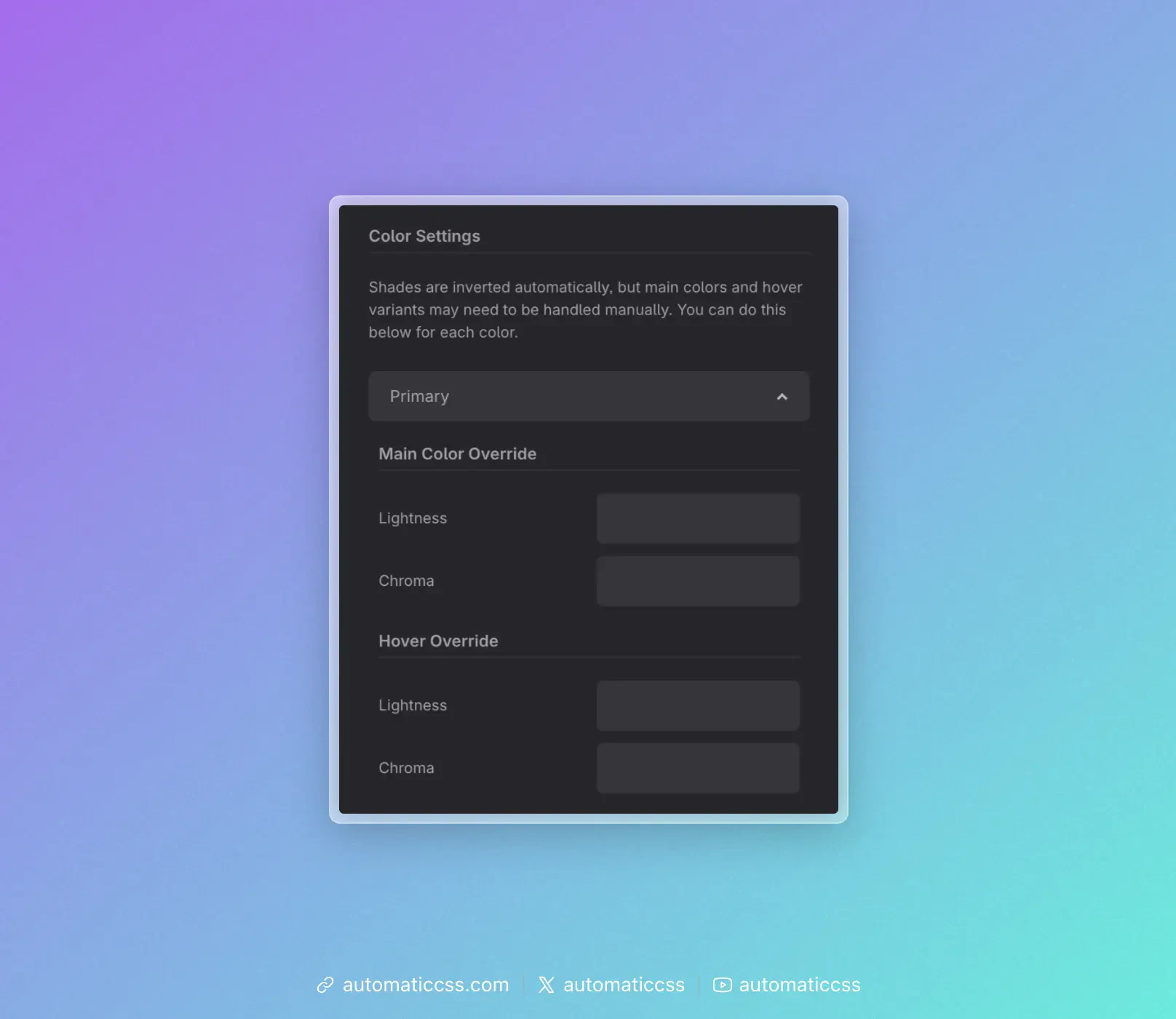
- Main Color Override – Lightness and Chroma for the dark side of
light-dark(main, alt). Leave blank to keep the same as light; set values to manually choose the dark-mode main color. - Hover Override – Same idea for the hover shade in dark mode.
So you can either rely on auto inversion only (no overrides) or tweak main/hover per color for dark mode. Overrides are optional.
Force Scheme
Some parts of the page may need to stay light on a dark site (or dark on a light site)—e.g. a quote card or an embed. Under Force Scheme you can set:
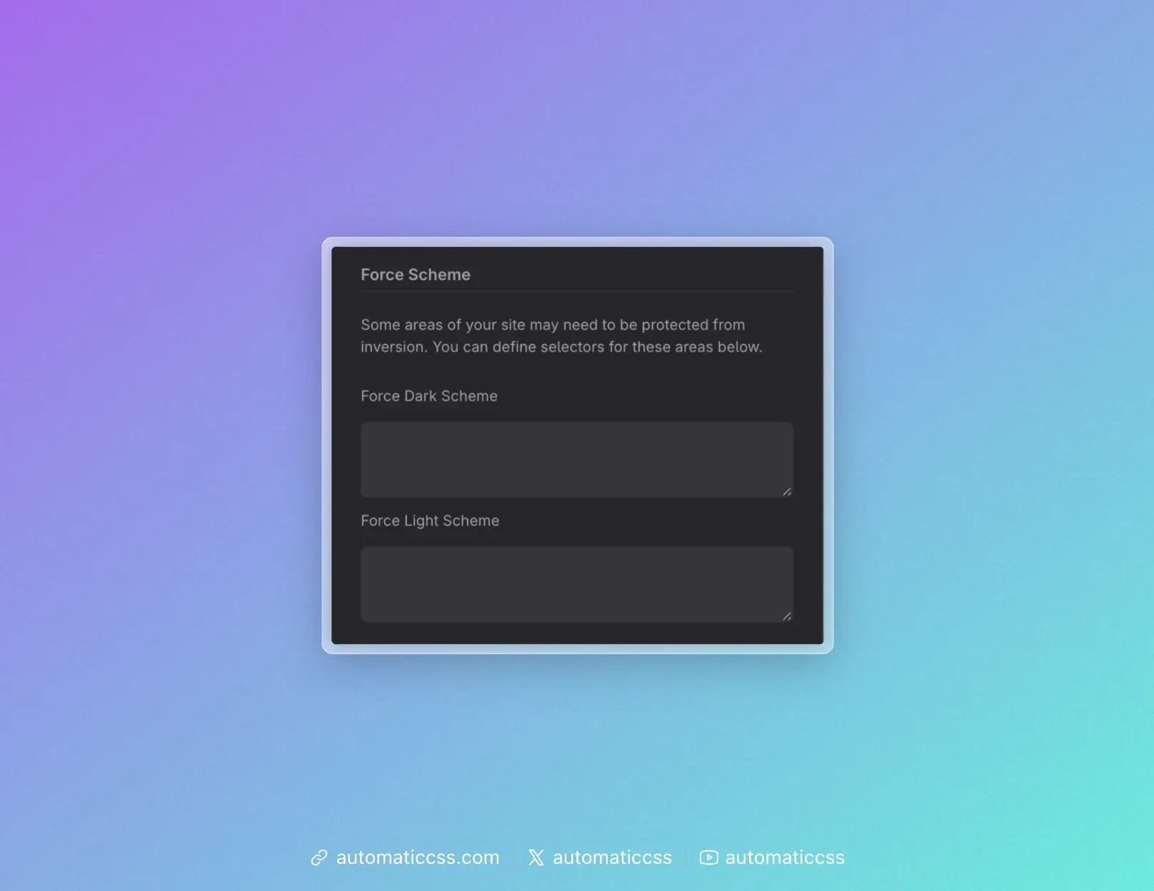
- Force Dark Scheme – A list of CSS selectors. Those elements get
color-scheme: dark, so they and their descendants use the dark value of everylight-dark()variable. - Force Light Scheme – Same idea for
color-scheme: light.
Alternatively, add the utility class .scheme--dark or .scheme--light to a wrapper so that subtree is forced to that scheme without configuring selectors in the dashboard.
Summary
| Setting | Effect |
|---|---|
| Enable Color Scheme Support | Converts palette to light-dark(), auto-inverts shades, enables scheme utilities. |
| Website Scheme | Sets default color-scheme on :root (light only, dark only, light dark, or normal). |
| Color Settings (per color) | Optional main/hover overrides for dark mode (lightness/chroma). |
| Force Scheme | Optional selectors (or use .scheme--light / .scheme--dark) to force a scheme on specific areas. |
For the underlying CSS (e.g. how color-scheme and light-dark() work), see Modern Color Scheme Workflow. For how to apply these settings in practice (user preference, manual switch, or component-level scheme), see Implementing Color Scheme.