Contextual Backgrounds
ACSS provides contextual background classes that not only set background colors but can also automatically adjust foreground elements (text, headings, links, buttons, icons) based on the background's lightness or darkness.
The Value of Color Abstraction
When building websites, it's common to have repeating design patterns: alternating light and dark sections, card backgrounds, highlighted areas, and so on. Rather than hard-coding specific colors throughout your project, ACSS provides an abstraction layer through contextual background classes.
Instead of manually setting background-color: var(--primary) on every dark section, you use .bg--dark. The actual color that .bg--dark represents is defined in the Color Assignments panel of the dashboard. This separation between usage and definition is what makes the system powerful.
This approach offers several benefits:
- Maintainability - Change the color assignment once in the dashboard, and every
.bg--darksection updates automatically - Consistency - Common design patterns (alternating light/dark sections, card backgrounds, etc.) use consistent, predictable classes
- Flexibility - Easily experiment with different color schemes without touching your markup
- Semantic meaning - Classes describe the intent (dark, light) rather than a specific color, making your code more readable
Contextual Background Classes
ACSS provides contextual background classes that represent abstract concepts rather than specific colors:
.bg--light- A light background (uses--bg-lightcolor).bg--ultra-light- An ultra-light background (uses--bg-ultra-lightcolor).bg--dark- A dark background (uses--bg-darkcolor).bg--ultra-dark- An ultra-dark background (uses--bg-ultra-darkcolor)
Configuring Background Colors
Navigate to Color Assignments > Backgrounds to configure the colors used by contextual background classes.
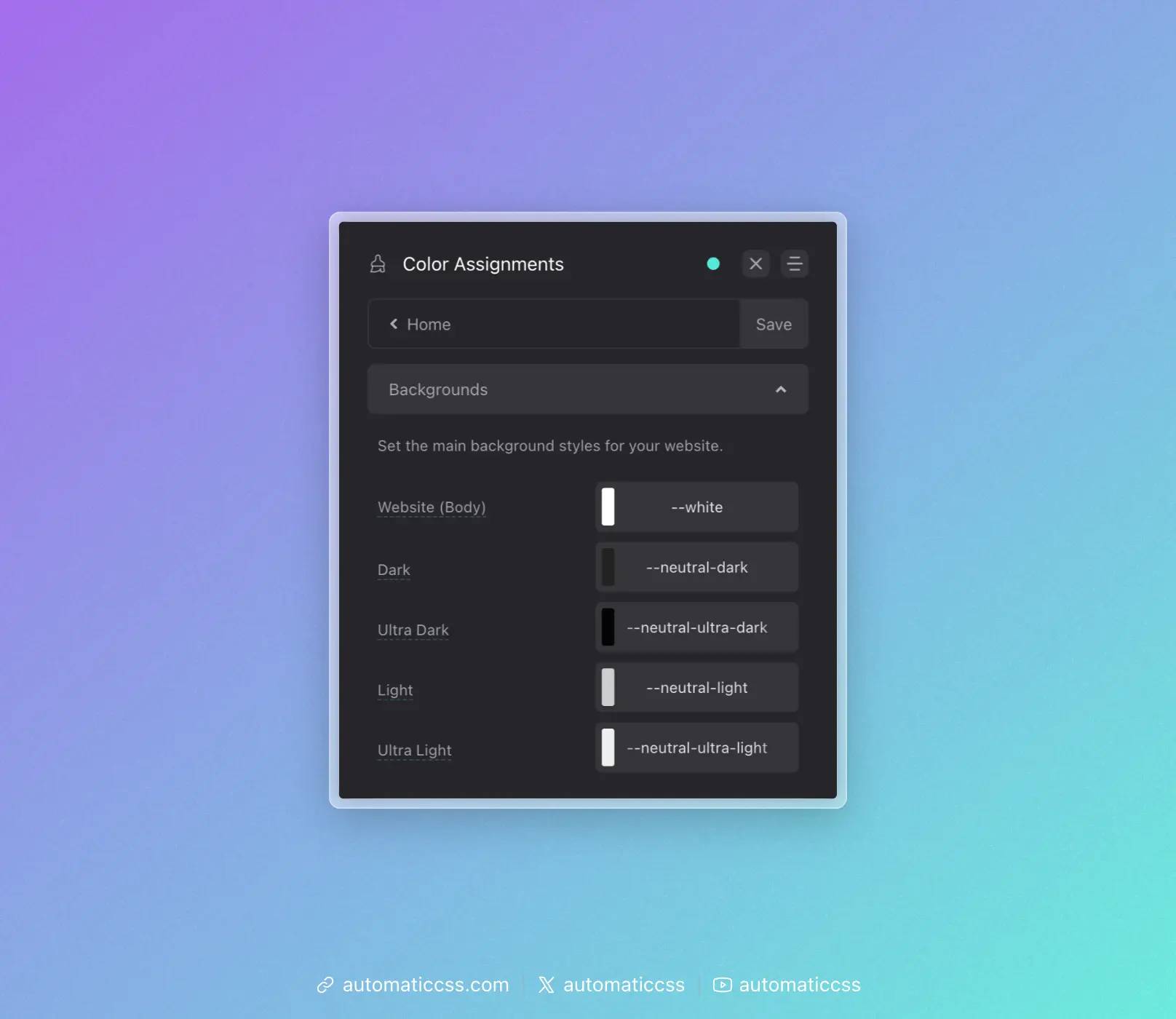
- Website (Body) - The default background color for your site
- Dark - The color used by
.bg--dark - Ultra Dark - The color used by
.bg--ultra-dark - Light - The color used by
.bg--light - Ultra Light - The color used by
.bg--ultra-light
Automatic Color Relationships
When enabled, ACSS automatically adjusts foreground colors when you use contextual background classes. This ensures text remains readable regardless of background color.
For example, when you apply .bg--dark to a section, ACSS can automatically:
- Change heading colors to light
- Change text colors to light
- Change link colors appropriately
- Adjust button styles
- Adjust icon colors
- Adjust focus indicator colors
Configuring Color Relationships
Navigate to Color Assignments > Light Relationships or Dark Relationships to configure which colors are applied automatically.
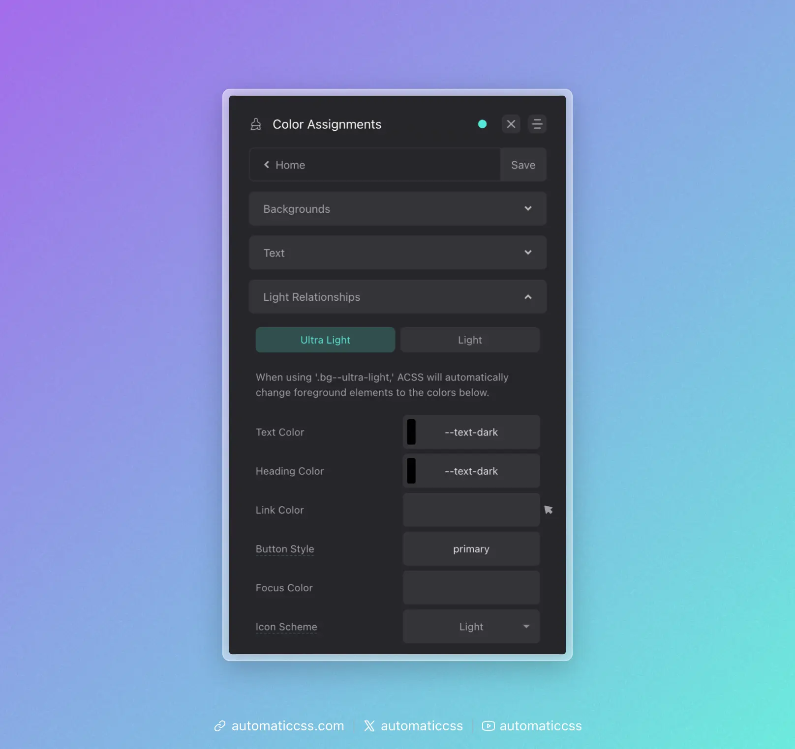
For each relationship type (Ultra Light, Light, Ultra Dark, Dark), you can configure:
- Heading Color - The color applied to headings
- Text Color - The color applied to body text
- Link Color - The color applied to links
- Link Hover Color - The color applied to links on hover
- Button Background - The background color for buttons
- Icon Color - The color applied to icons
- Focus Color - The color used for focus indicators
Enabling/Disabling Color Relationships
The automatic color relationship feature can be toggled on or off in Options > Defaults & Misc.
Using with Surfaces
Surfaces can also participate in the automatic color relationship system. When you create a surface and assign it a color relationship (light, dark, ultra-light, or ultra-dark), it will automatically trigger the same foreground color adjustments as the corresponding .bg-- class.
This means you can create complex background patterns or textures that still benefit from automatic text color adjustments.
Changes From 3.x
In ACSS 4.0:
- Background classes and color relationships remain largely unchanged
- Surfaces now integrate with the color relationship system
- Dashboard location remains at Color Assignments > Backgrounds