Main Colors
Main Colors are the six named slots in the ACSS palette: Primary, Secondary, Tertiary, Accent, Base, and Neutral. You configure them in the dashboard under Palette > Main Colors (enable only the ones you need). Each main color is expanded into a full scale of shades (ultra-light through ultra-dark, plus hover) that you can use via classes and variables.
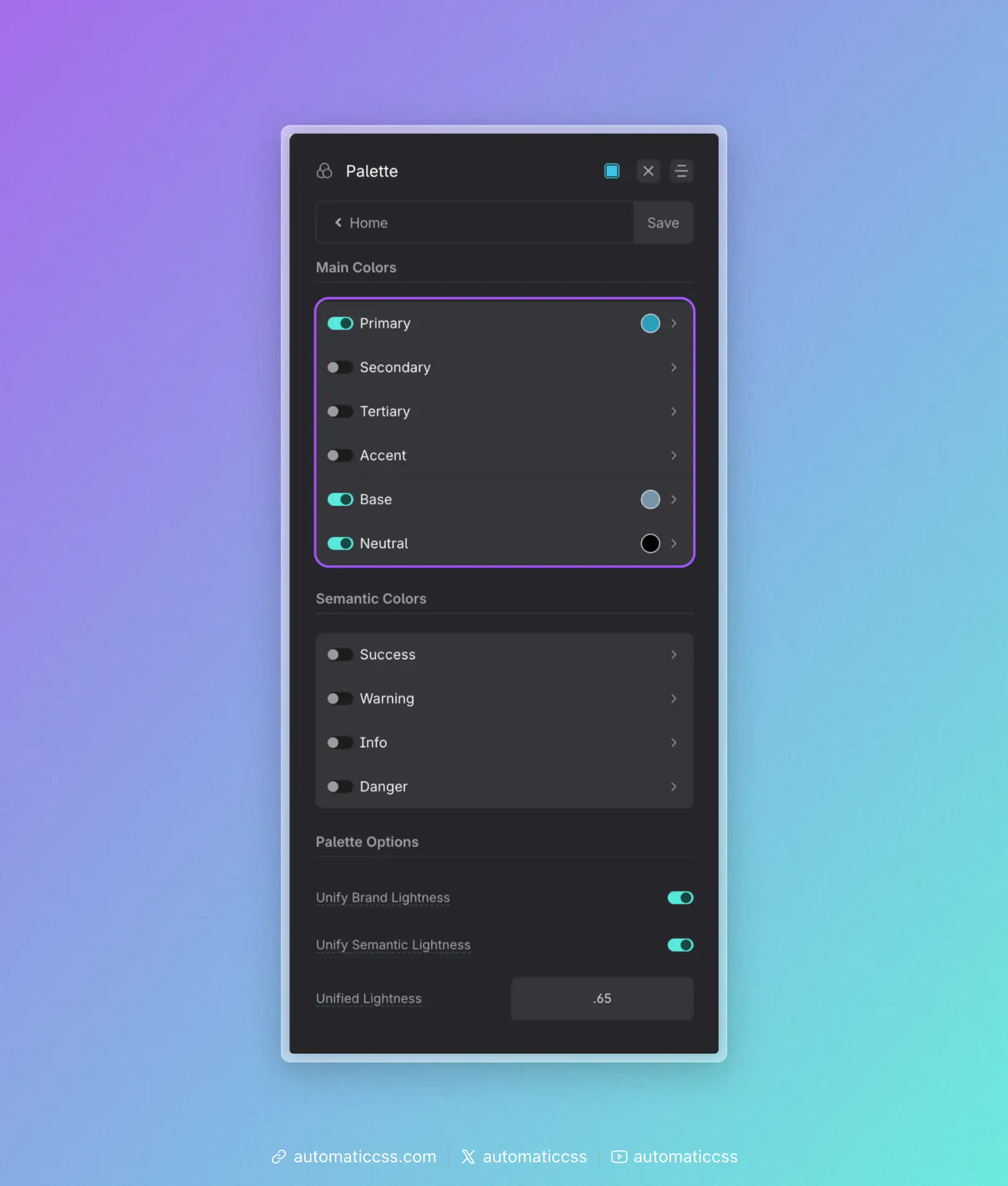
The six main colors
| Color | Role in a typical project |
|---|---|
| Primary | The main brand color—logos, key CTAs, links, and the main “action” color. Use it where you want the eye to go first. |
| Secondary | The second brand color. Use for less dominant buttons, highlights, or supporting elements so Primary stays the star. |
| Tertiary | A third brand color. Use sparingly for variety (e.g. alternate sections, tags, or accents) without competing with Primary and Secondary. |
| Accent | The least used brand color. Use for special emphasis, badges, or one-off moments so it stays noticeable when it appears. |
| Base | The workhorse for backgrounds and body text. Often a dark shade for text on light UIs, or a light shade for light backgrounds. Drives default section and card backgrounds and readable text. |
| Neutral | Greys from white to black. Use for borders, dividers, disabled states, subtle backgrounds, and any place you need “no hue” so brand colors stand out. |
You don’t have to enable all six. Many sites use Primary, Base, and Neutral; add Secondary, Tertiary, or Accent when the design calls for them.
How to use them in a typical project
Think in roles, not hex codes. Decide “this is a primary action” or “this needs a neutral border,” then use the matching class or variable (e.g. .btn--primary, var(--base-dark)). If you rebrand later, you change the color once in the dashboard and the whole site updates.
Reserve Primary for what matters. Buttons that submit, main links, and key CTAs should use Primary (or a Primary shade). Use Secondary or Neutral for less important actions so Primary stays strong.
Use Base for default UI. Body text and default section backgrounds usually come from Base (or Neutral). That keeps the canvas consistent and leaves Primary/Secondary for emphasis.
Use Neutral for structure. Borders, dividers, and subtle grey backgrounds are good fits for Neutral. Avoid using a brand color for “just a line” or “just a grey box.”
Keep Accent rare. Use Accent for a few high-impact spots (e.g. “New” badges, one hero accent). If it’s everywhere, it stops feeling special.
Once your main colors are set, use Color Assignments to map them to contexts (e.g. light/dark backgrounds, muted text) and Automatic Color Relationships so foreground styles follow background classes. For transparencies, see Transparencies.