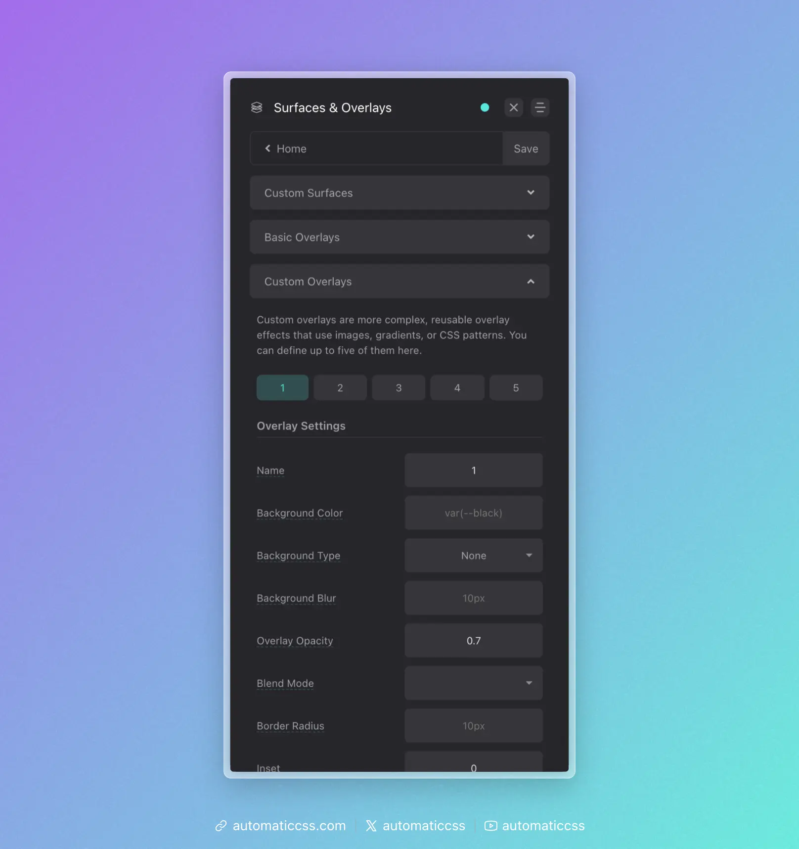
Custom Overlays
Custom overlays allow you to create reusable, highly configurable overlay effects that can include gradients, images, blur effects, blend modes, animations, and more. Configure up to 5 custom overlays in the ACSS dashboard under Surfaces & Overlays > Custom Overlays.
Creating a Custom Overlay
In the dashboard, each custom overlay has the following options:
| Option | Description |
|---|---|
| Name | Optional custom name (creates .overlay-[name] class) |
| Background Color | Solid color for the overlay |
| Background Type | Choose between gradient, image, or none |
| Background/Asset | The gradient or image URL |
| Background Size | Size of the background (e.g., cover, contain, 200px) |
| Background Position | Position of the background (e.g., center center) |
| Background Attachment | Scroll behavior (scroll, fixed, local) |
| Background Repeat | Repeat behavior (repeat, no-repeat, etc.) |
| Backdrop Blur | Blur amount for the backdrop filter |
| Blend Mode | Mix blend mode for the overlay |
| Opacity | Opacity of the overlay (default: 0.7) |
| Border Radius | Border radius for rounded overlays |
| Animation | CSS animation to apply |
| Inset | Custom inset values (default: 0) |
Using Custom Overlay Classes
Each configured overlay generates utility classes:
<!-- By number -->
<div class="overlay-1">
  <h2>Content above overlay</h2>
</div>

<!-- By custom name (if configured) -->
<div class="overlay-gradient">
  <h2>Content above overlay</h2>
</div>
Both the numbered class (.overlay-1) and named class (.overlay-gradient) will work if you've set a custom name.
Locally Scoped Variables
Custom overlays expose CSS custom properties that you can override at runtime. Each property has a global override and a per-overlay fallback:
.my-section .overlay-1 {
  /* Global override (affects all overlays on this element) */
  --overlay-opacity: 0.5;

  /* Or use the specific overlay variable */
  --overlay-1-opacity: 0.5;
}
Available Variables
| Variable | Per-Overlay Variable | Description |
|---|---|---|
--overlay-bg-color | --overlay-[n]-bg-color | Background color |
--overlay-background | --overlay-[n]-background | Background gradient |
--overlay-background-size | --overlay-[n]-background-size | Background size |
--overlay-background-position | --overlay-[n]-background-position | Background position |
--overlay-background-repeat | --overlay-[n]-background-repeat | Background repeat |
--overlay-background-attachment | --overlay-[n]-background-attachment | Background attachment |
--overlay-background-blur | --overlay-[n]-background-blur | Backdrop blur |
--overlay-opacity | --overlay-[n]-opacity | Opacity |
--overlay-blend-mode | --overlay-[n]-blend-mode | Mix blend mode |
--overlay-border-radius | --overlay-[n]-border-radius | Border radius |
--overlay-animation | --overlay-[n]-animation | Animation |
--overlay-inset | --overlay-[n]-inset | Inset positioning |
--overlay-z-index | --overlay-[n]-z-index | Z-index (default: -1) |
Example: Gradient Overlay
Configure in the dashboard:
- Name:
dark-gradient - Background Type: Gradient
- Background:
linear-gradient(to bottom, transparent 0%, rgba(0,0,0,0.8) 100%) - Opacity: 1
Use in your HTML:
<div class="overlay-dark-gradient">
  <img src="hero.jpg" alt="Hero">
  <div class="hero__content">
    <h1>Title appears above gradient</h1>
  </div>
</div>
Example: Blur Overlay
Configure in the dashboard:
- Name:
blur - Background Color:
rgba(255, 255, 255, 0.1) - Backdrop Blur:
10px - Opacity: 1
This creates a frosted glass effect.
Example: Dynamic Opacity on Hover
.card {
  --overlay-opacity: 0.7;
  transition: --overlay-opacity 0.3s ease;
}

.card:hover {
  --overlay-opacity: 0.3;
}
Technical Details
Custom overlays use a pseudo-element (configurable to ::before or ::after) with:
position: absolutewithinsetfor full coveragez-index: -1to appear behind content- Parent receives
position: relativeandisolation: isolate
Changes From 3.x
In ACSS 4.0:
- Added backdrop blur support for frosted glass effects
- Added animation support for animated overlays
- Added nested overlay support via
border-image - Added custom inset for partial overlays
- All properties now use CSS custom properties for runtime customization