Card Color Scheme
The Card Framework uses the CSS color-scheme property to manage light and dark card variants. This provides a clean, standards-based approach to card theming that integrates with browser and OS preferences.
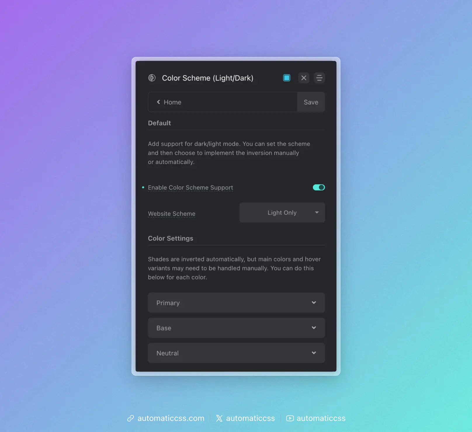
Prerequisite: Color Scheme Support must be enabled in Colors > Color Scheme for these features to work.
Default Card Scheme
Set the default color scheme for all cards in Cards > Card Styling > Default Card Scheme:
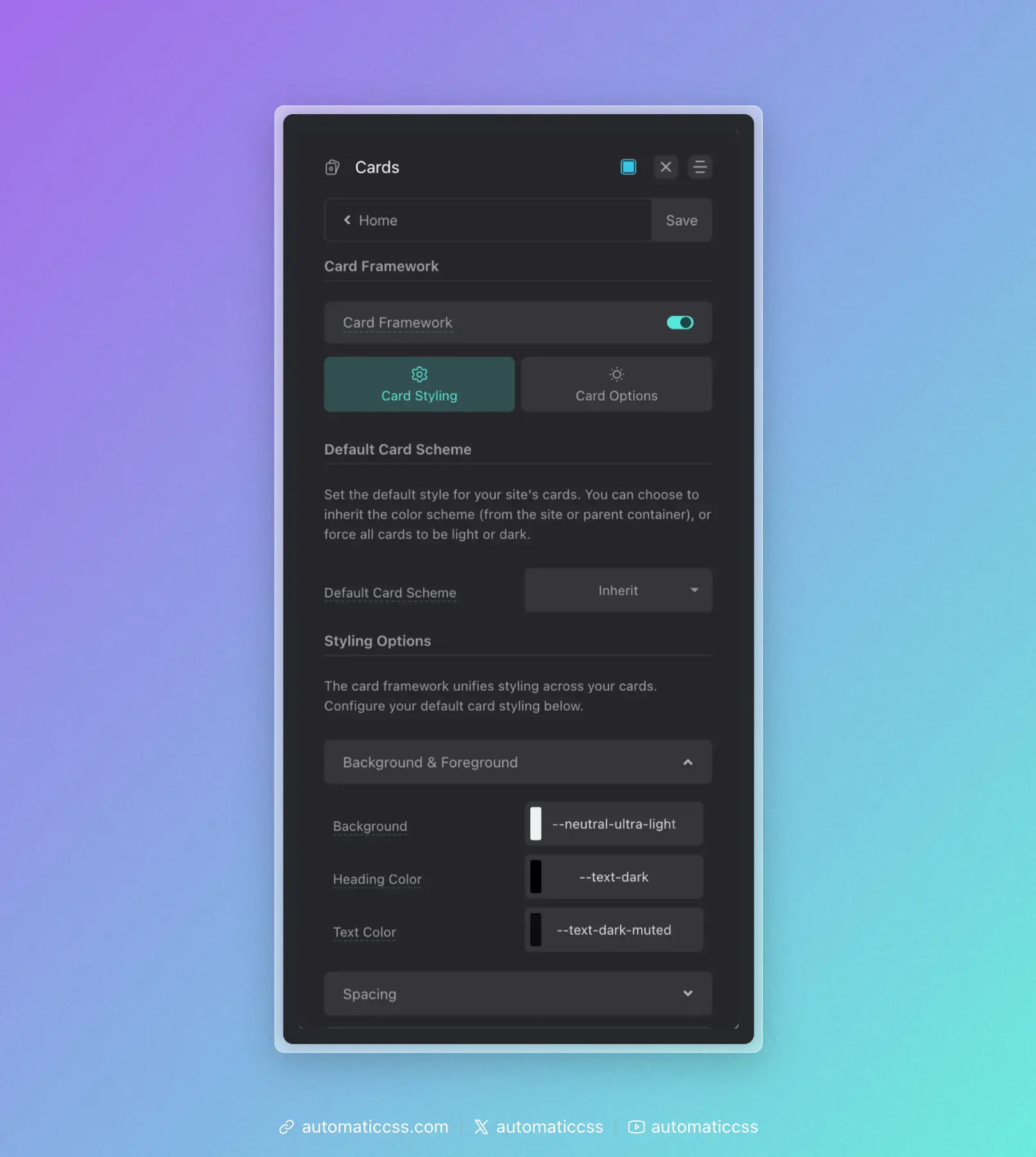
- Inherit – Cards inherit the color scheme from the site or parent container
- Light – Force all cards to use light styling
- Dark – Force all cards to use dark styling
Per-Card Overrides
Individual cards can override the default scheme by adding a modifier to their class name:
<!-- Force this card to be dark regardless of default -->
<div class="service-card--dark">
    ...
</div>

<!-- Force this card to be light regardless of default -->
<div class="testimonial-card--light">
    ...
</div>
The framework detects --light or --dark in the class name and applies the appropriate color-scheme value.
How Color Scheme Works
The color-scheme CSS property tells the browser which color schemes an element supports. When set to light or dark, form controls, scrollbars, and other browser-rendered UI elements adapt accordingly.
More importantly, it provides a semantic signal that can be used with CSS to style content appropriately:
.my-card {
    /* Light scheme styles apply by default */
    background: var(--white);
    color: var(--text-dark);
}

@media (prefers-color-scheme: dark) {
    .my-card {
        /* Dark scheme styles when user prefers dark */
        background: var(--neutral-dark);
        color: var(--text-light);
    }
}
Styling Light vs Dark Cards
The Card Framework automatically adjusts colors based on the color scheme. Configure your defaults in the Card Styling panel:
Background & Foreground
- Background – The card background color
- Heading Color – Color for headings inside cards
- Text Color – Default text color inside cards
These values should work well with both light and dark schemes, or you can use color variables that respond to color scheme changes.
Integration With Site Color Scheme
When Default Card Scheme is set to "Inherit," cards will follow the color scheme of their parent container or the site. This is useful for:
- Sites with a global dark/light mode toggle
- Cards placed in sections with different background colors
- Respecting user OS preferences via
prefers-color-scheme
Changes From 3.x
In ACSS 4.0:
- Card variants now use the
color-schemeCSS property instead of separate light/dark class systems - Added "Inherit" option for Default Card Scheme to follow parent/site color scheme