Card Styling
The Card Framework provides centralized control over card styling. Configure your defaults once, and they apply to all targeted cards automatically.
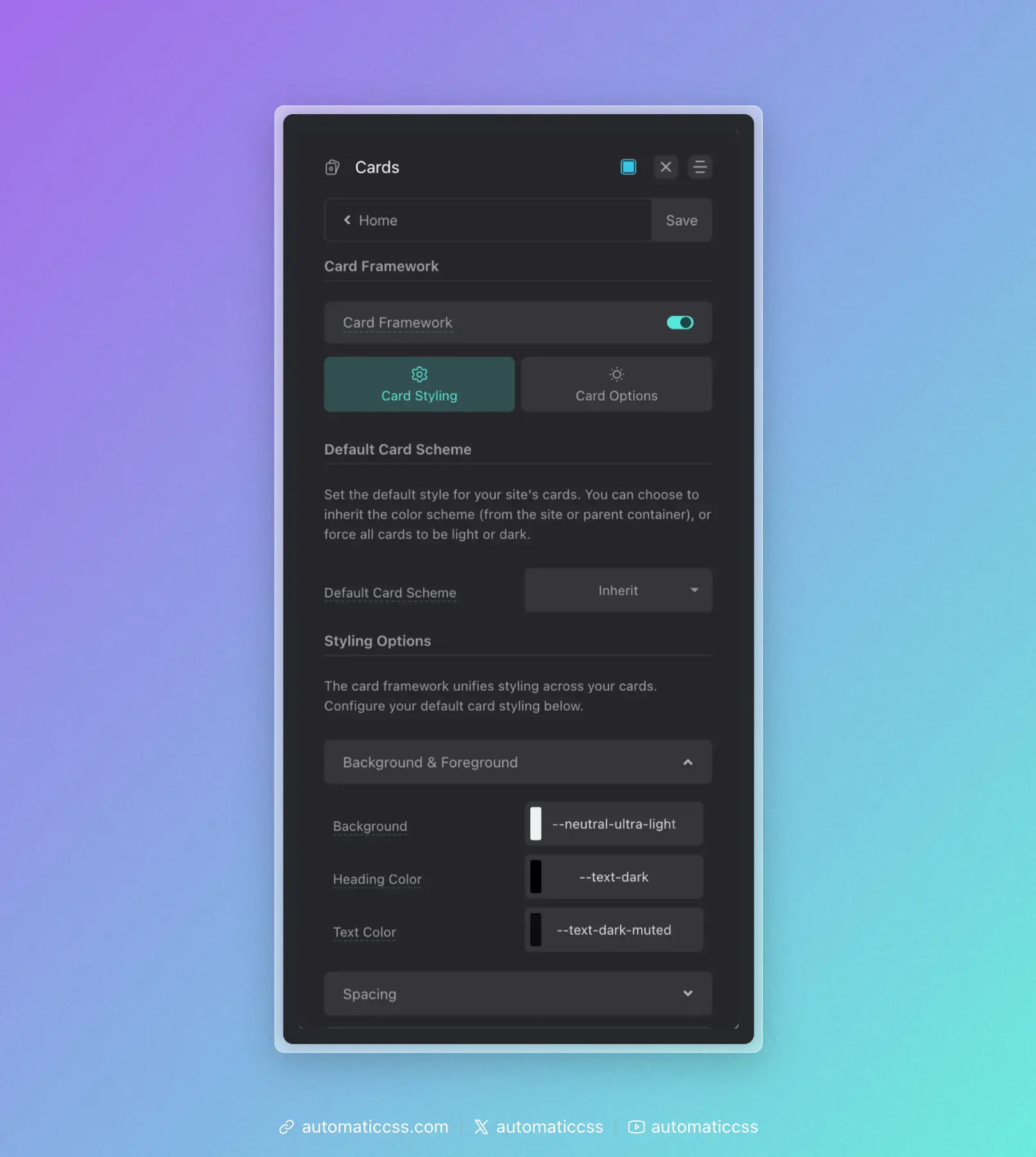
Enabling the Card Framework
The Card Framework is turned off by default, though we highly recommend you turn it on. Navigate to Cards from the main dashboard and toggle the framework on.
Once enabled, you'll need to specify which cards to target and optionally configure the default color scheme.
How Styling Works
ACSS uses tokens for all card styling, prefixed with "card." You set defaults from the dashboard, then override on a per-class basis as needed.
For example:
- Padding is applied with
var(--card-padding) - Gap is applied with
var(--card-gap) - Radius is applied with
var(--card-radius)
This is all done automatically—you never have to manually apply these to your cards.
Styling Options
Configure your default styling in Cards > Card Styling > Styling Options:
Background & Foreground
- Background – Card background color or value
- Heading Color – Color for card headings
- Text Color – Default text color inside cards
Spacing
- Card Padding – Main padding value for card content
- Card Content Gap – The gap between content inside cards
Typography
- Heading Size – Size of headings (h1-h6) inside cards
- Text Size – Default size of text inside cards
Borders
- Concentric Radius – Controls how border radius is calculated for cards and their inner elements (media, icons, avatars). Options:
- Off – No concentric radius math. You set the card's border radius manually via the Border Radius input.
- Standard – The card's outer radius is automatically expanded (
--radius + --card-padding) so that inner elements using the global--radiusappear visually proportional. This is the traditional concentric radius approach. - Reverse – The card's outer radius stays at the global
--radius, and inner elements receive a smaller calculated radius (--radius - --card-padding), clamped to a minimum value. This is useful when you want the card itself to match other elements on the page while still maintaining proportional inner corners.
- Minimum Radius – (Visible when Concentric Radius is set to Reverse) Sets the floor for the inner radius calculation. Prevents inner element corners from becoming too small or flat when padding is large. Defaults to
4px. - Border Width – Thickness of the card border
- Border Style – Style of the card border (solid, dashed, etc.)
- Border Color – Color of the card border
- Border Radius – Radius of the card corners (only visible when Concentric Radius is Off)
Buttons & Links
- Link Color / Link Hover – Link colors inside cards
- Button Style – Which button style to use for buttons inside cards
- Button Text Size – Size of button text inside cards
Icons
Icons must use the [data-icon] data attribute to be styled by the card framework.
- Icon Size – Size of icons
- Icon Color – Color of icons
- Use Boxed Icon Style – Enable padding, border, and background for icons
When Boxed Icon Style is enabled:
- Icon Padding – Padding around the icon
- Icon Border Width/Style/Color – Border properties for the icon box
- Icon Radius – Corner radius of the icon box
- Icon Background – Background color of the icon box
Avatars
Avatars are targeted with __avatar in the class name.
- Avatar Size – Size of the avatar
- Border Width/Style/Color – Border properties for avatars
- Radius – Corner radius (use
50vwfor a circle) - Aspect Ratio – Aspect ratio of avatars (use
1for circles)
Media
Media elements are targeted with __media in the class name.
- Radius – Corner radius of media elements
- Aspect Ratio – Aspect ratio of media
- Object Fit – How media fills its container
Shadows
- Card Shadow – Box shadow for cards (e.g.,
var(--box-shadow-1))
More Options
Display Grid
By default, cards use display: flex with flex-direction: column. You can enable Default Cards to Display Grid in Card Options to use CSS Grid instead.
Overriding Styles Per Card
Override framework defaults on specific cards by redefining the tokens:
.pricing-card {
    --card-padding: var(--space-l);
    --card-heading-size: var(--h2);
    --card-radius: var(--radius-l);
}
You can also remove default styling and apply tokens elsewhere:
.article-card {
    padding: 0;
    gap: 0;
}

.article-card__content-wrapper {
    padding: var(--card-padding);
    gap: var(--card-gap);
}
Card Variables Reference
The following variables are available for use in your custom styles:
--card-padding--card-gap--card-radius--card-min-radius--card-border-width--card-border-style--card-border-color--card-background--card-heading-size--card-heading-color--card-text-size--card-text-color--card-link-color--card-link-color-hover--card-button-font-size--card-icon-size--card-icon-color--card-avatar-size--card-avatar-radius--card-media-radius--card-media-aspect-ratio--card-shadow
Changes From 3.x
In ACSS 4.0:
- Icons must use the
[data-icon]data attribute for card framework styling - Added boxed icon styling options
- Added display grid option for cards
- Added shadow control for cards